- Home
- About
- What We Do
- Solutions
- Work
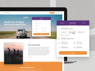
BookMyTaxi
Helping BookMyTaxi capture a larger audience with an online platform.
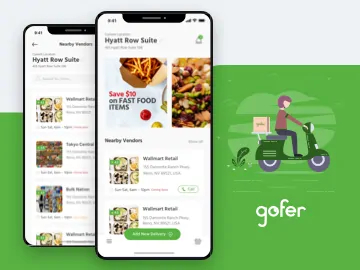
Gofer
How we changed the experience around running errands through gofer.
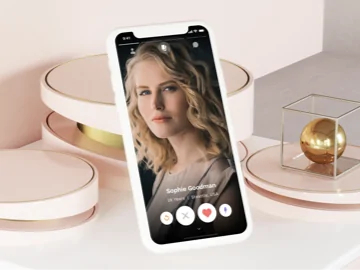
Sparker
Designing a platform that goes beyond just a dating app
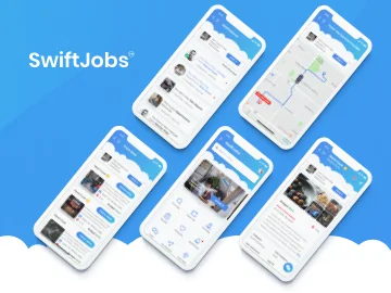
SwiftJobs
Simplifying your everyday job search and service hunt
- Technology
- Methodology
Sparker
Mobile
Designing a platform that goes beyond just a dating app
About Sparker
Sparker is an app that lets people discover and meet interesting people nearby. It goes beyond just a chatting platform as it lets potential matches benefit from restaurant rewards and event informations, if they’d like to meet.
Our Task
Our young client wanted Sparker to be different than other dating apps in the market. The common experience around such apps is to swipe right and chat with people, but the idea behind Sparker was to enhance the experience of meeting friends online and offline. We were handed the task of designing an attractive and innovative UI for the dating app that outstands its competitors in terms of the theme, look, feel and functionality.

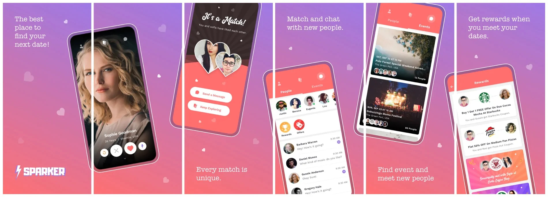
Discover interesting people near you

Match and chat with the people
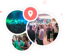
Find events nearby and meet people
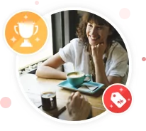
Get rewards when you meet your dates
Design Conceptualization
Our team of UI/UX designers started off by researching the market trend in dating apps and discovered what the users would most likely be comfortable using. They outlined several features and functionality that were up to the industry standard and only enhanced it further by adding a few core UX features.
As the client only had a blur vision, we helped him ideate and come up with few outstanding features that are not usually found on dating apps.
Visual Design
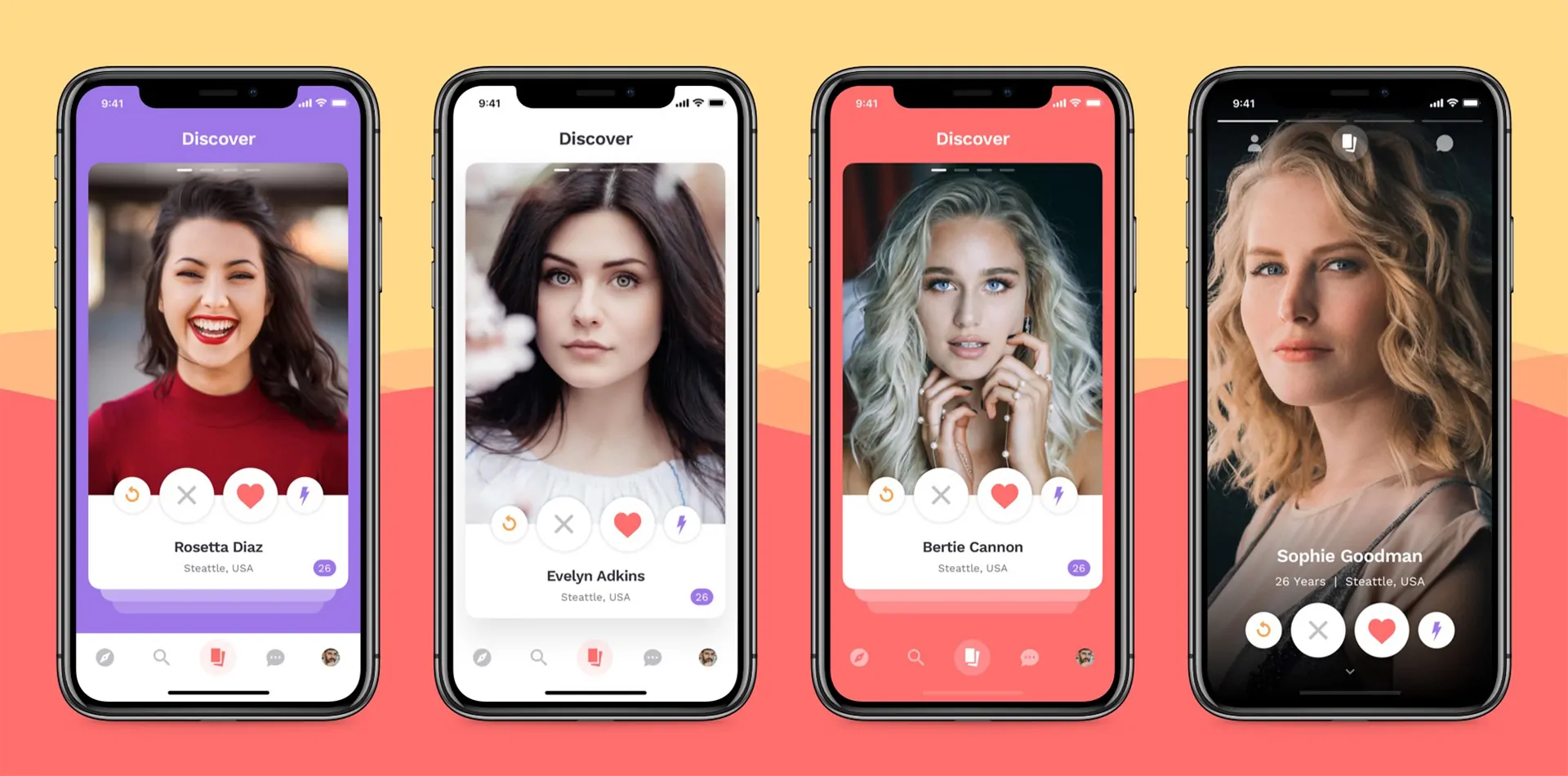
Next we moved onto interface and visual design. Younger people and millennials being the target audience, the client had a clear vision for the designs. We kept the look, theme and feel very modern and simplistic. Added line icons and elements that enhanced the overall look. With minimal and important information placed correctly, we kept the design clean and clutter free and provided various versions to the client to choose from.
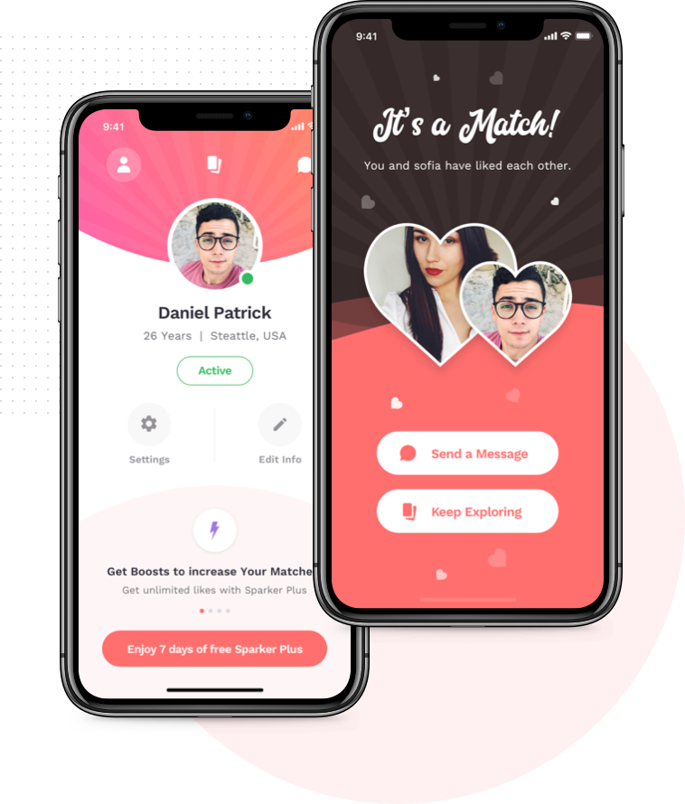
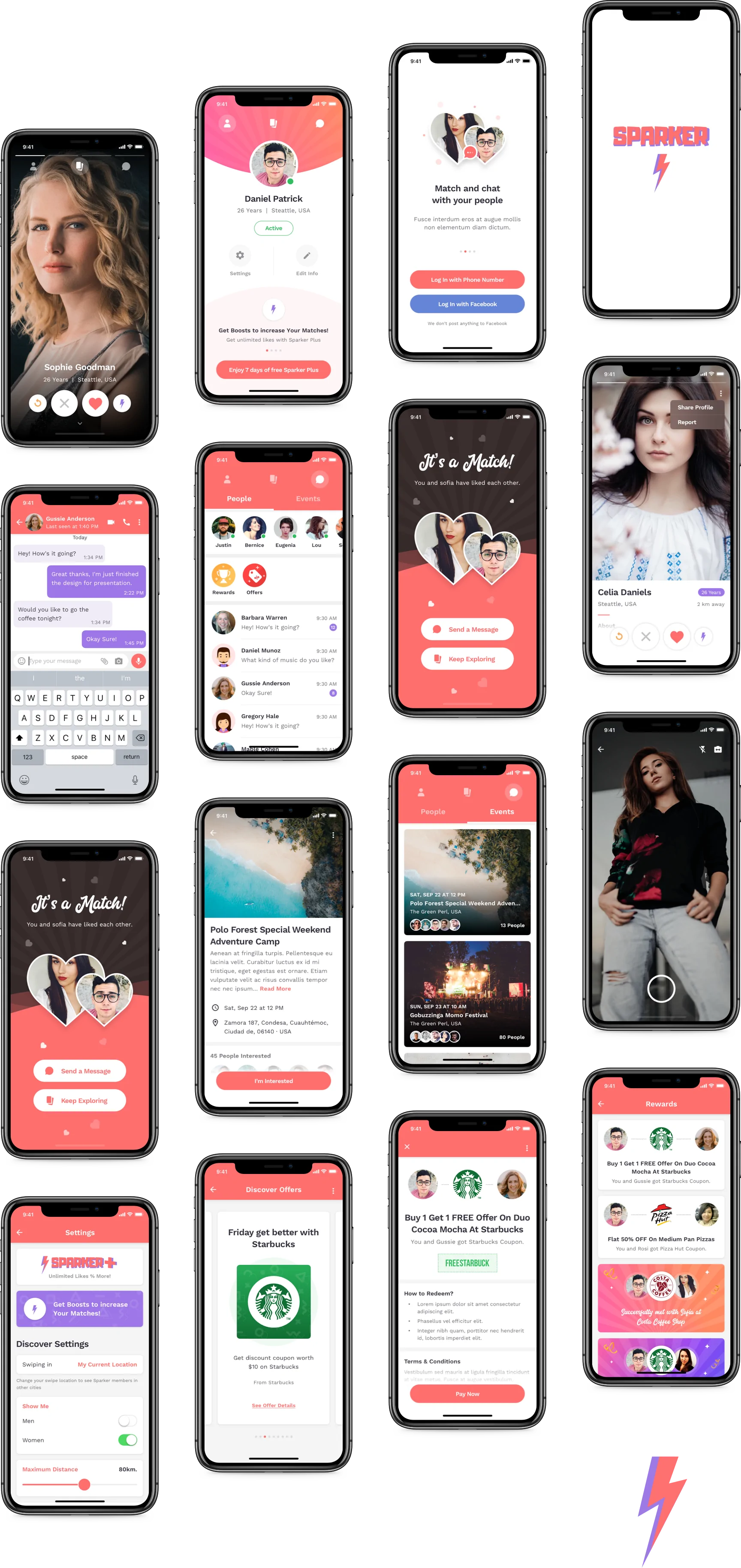
Innovative profile and match screen
Although we kept the UI similar to other industry standards, we added fun elements in the profile and match screen to enhance the experience and provide an edge.

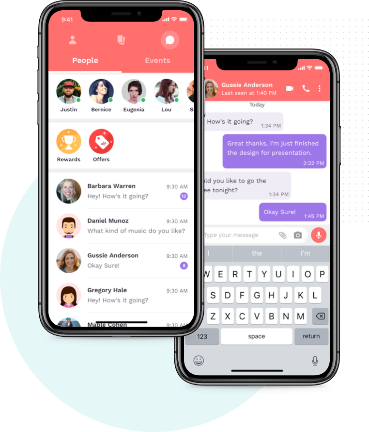
View online friends and rewards
To enhance the UX, we added a list view of matches that are online so users can easily tap on their photos and chat with them. We also added a rewards and offers icon so users can quickly access them.
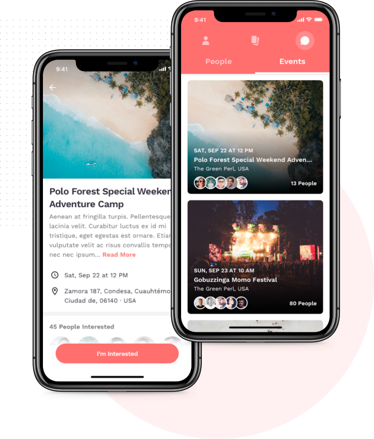
View events nearby
An added feature to the platform was viewing events nearby with their detailed information. Users can also view the people interested /going to the event.

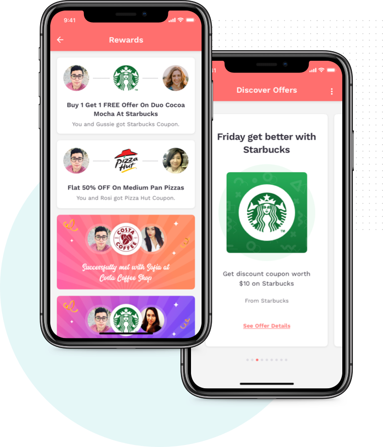
Get rewards for meeting matches
One of the top features of the app was rewards and offers at restaurants and cafes if they met there. To make it look aesthetically pleasing we added fun elements by using icons and logos.
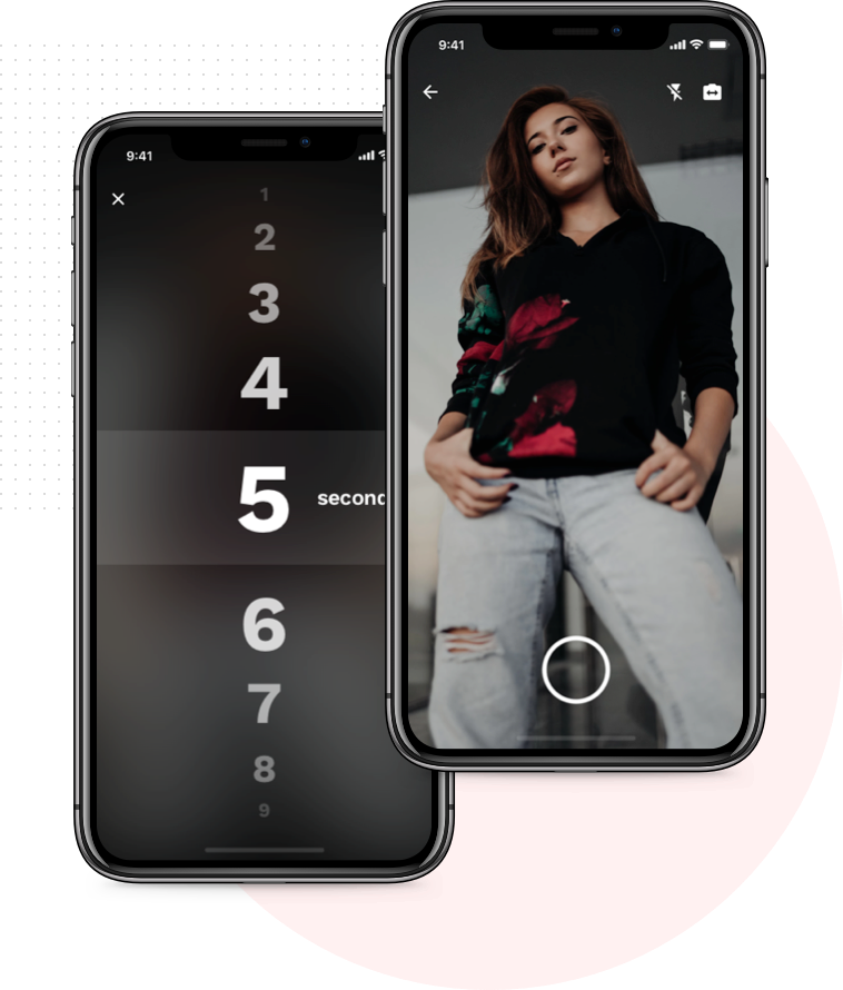
Snapchat like built-in camera
Another outstanding feature was to integrate a snapchat like camera in the app which is very trendy amongst the youth. Our team suggested the client to add all these features to make his app different than that of competitors.

Final Takeaway
With ample number of competitors in the industry of dating apps, the client chose FewMoreTaps to create a product that would stand out from the current market expectations. We were happy to bring the product designs to life just how the client had imagined.
"Awesome, great stuff. You out here killing it" -
Daniel Patrick
Ready to start a Project?
Trusted by

Ron Shai & Slava
FEPO Corporation
“What a team! Unbelievable. Starting from task to completion, we couldn’t have asked for a better team.”

Kevin Giffhorn
WeLearn Educational
“They listened to my ideas, made recommendation and helped me make the app that I wanted to make.”

Daniel Lewis
Forex Signal
“FewMoreTaps comes up with great ideas that we implemented, which helped my business.”
All projects secured by NDA &100% Secure. Zero Spam.
This site is protected by reCAPTCHA and the Google Privacy Policy and Terms of Service apply.
To start, use form below to tell us about you and the project

