- Work
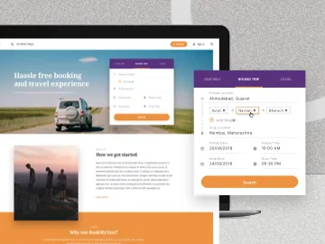
BookMyTaxi
Helping BookMyTaxi capture a larger audience with an online platform.
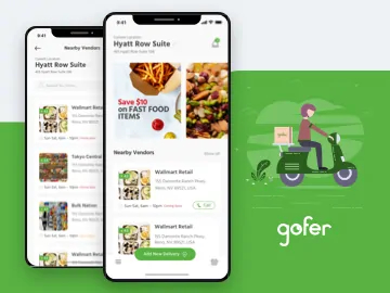
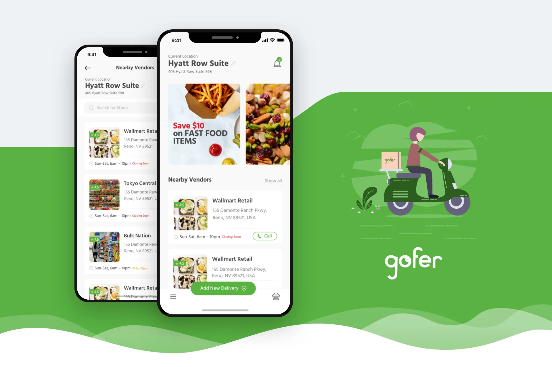
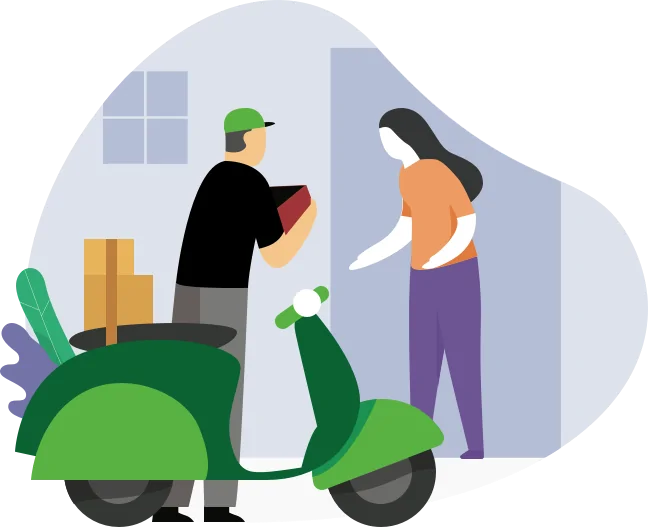
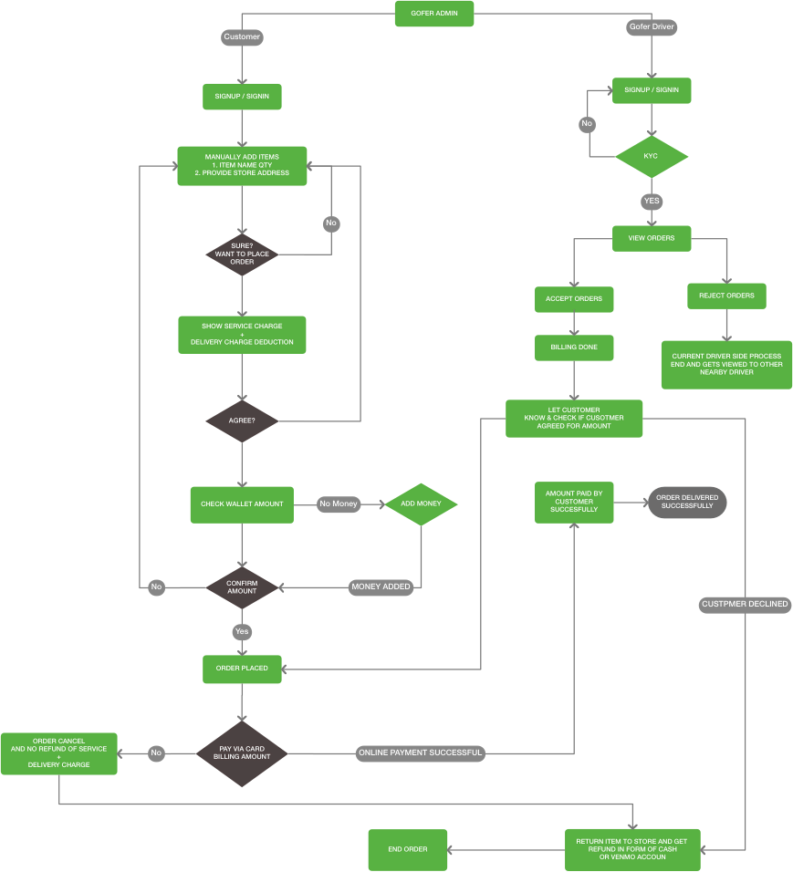
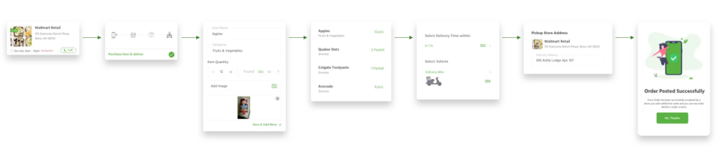
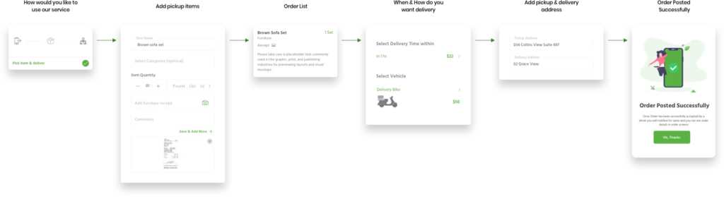
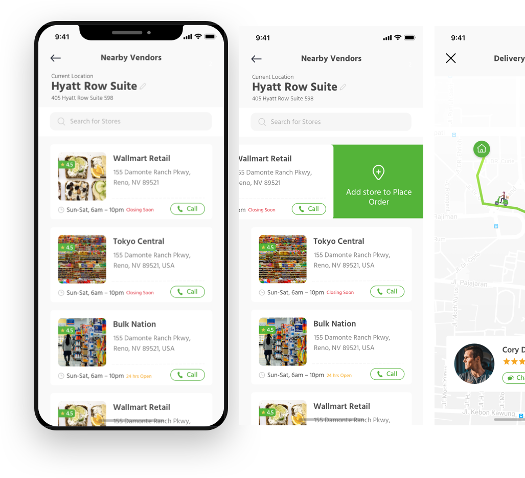
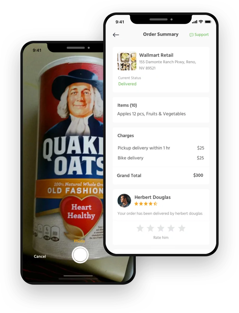
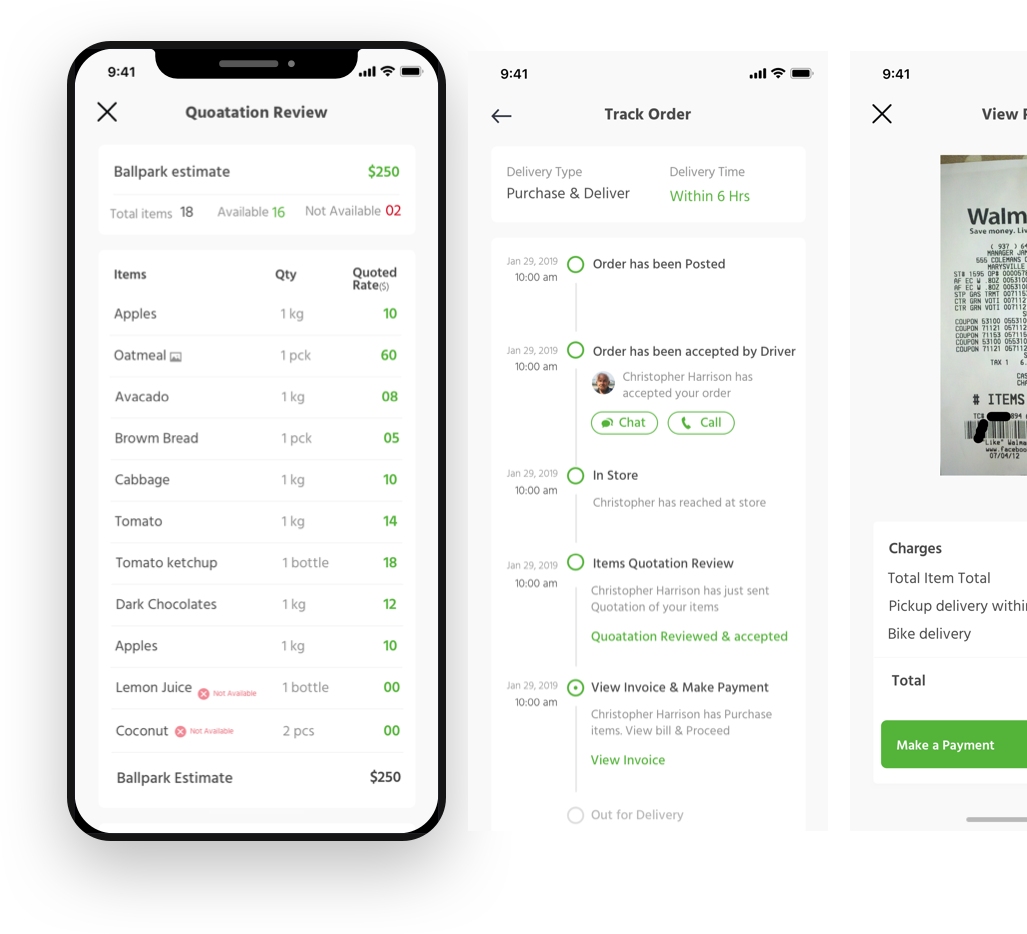
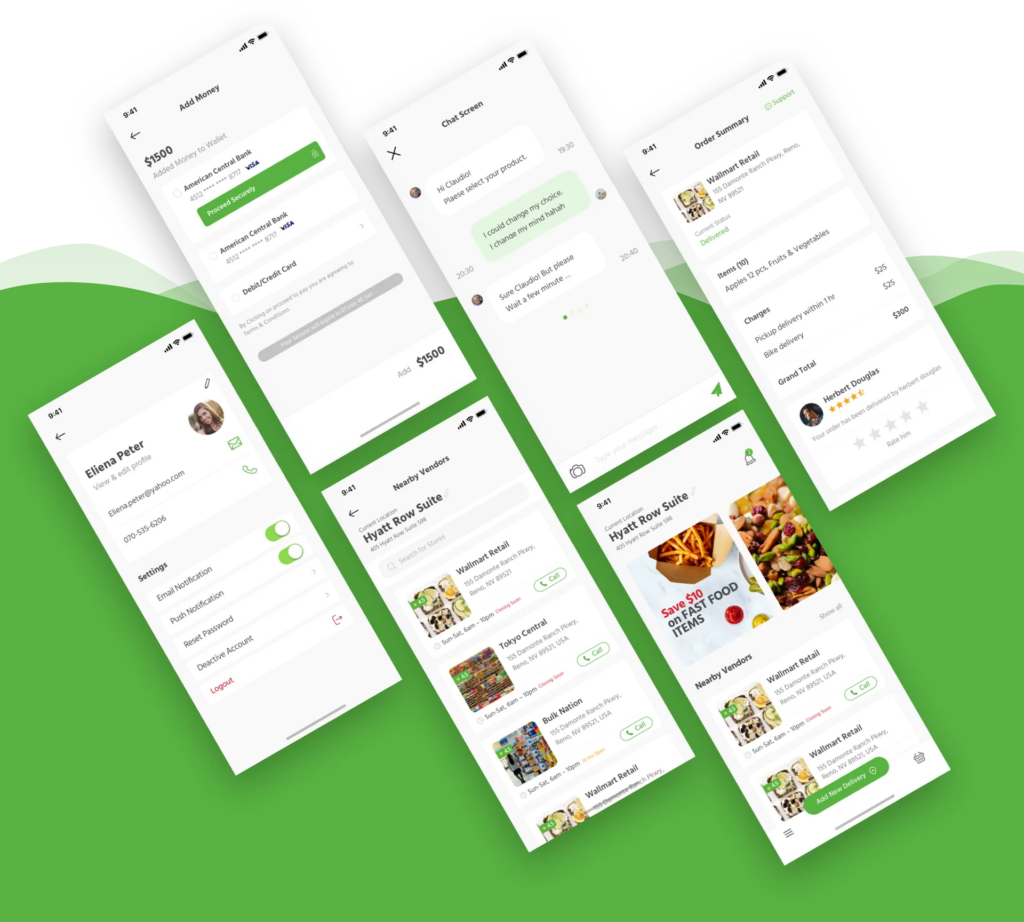
Gofer
How we changed the experience around running errands through gofer.

Sparker
Designing a platform that goes beyond just a dating app
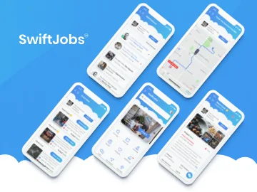
SwiftJobs
Simplifying your everyday job search and service hunt