- Home
- About
- What We Do
- Solutions
- Work
BookMyTaxi
Helping BookMyTaxi capture a larger audience with an online platform.
Gofer
How we changed the experience around running errands through gofer.

Sparker
Designing a platform that goes beyond just a dating app
SwiftJobs
Simplifying your everyday job search and service hunt
- Technology
- Methodology
SwiftJobs
Website | Mobile App
Simplifying your everyday job search and service hunt
Defining the problem
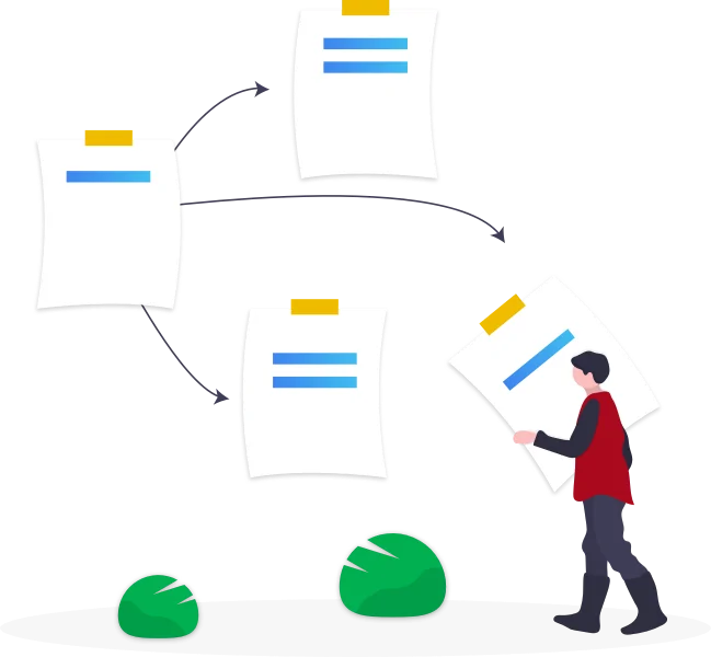
The idea behind SwiftJobs is to find services for daily chores, household tasks or personal wellness affairs. It also aims to connect people offering these services with their potential clients on a broader level.
This was an industry niche that needed to be addressed, and despite of some options being available in the market, none of them being as extensive. So our client wanted FewMoreTaps’s expertise in creating a solution from start to end.
Enhancing the idea
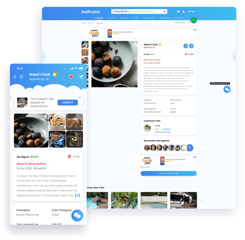
Our team of business analysts played a crucial role in building the idea of “SwiftJobs” and giving a direction to the platform. When the client approached us with the idea he wasn’t very clear about what exactly he wanted to build.
Our team suggested that we create a free and secure platform that offered paid services between individuals. The vision was to bring different people together, ones who offer services and the ones who seek them, by making it easy to pinpoint everyday tasks or services in local communities. The foundation of the idea being “by helping each other, we can call benefit”.

The design challenge
Our challenge was to overcome the short sighted vision into a broader idea, that would not just be limited to a given community, but also make a change on a larger geographical scale. After long brainstorming and ideation sessions, we were able to shed more light in terms of design, functionality and usability. A thorough analysis of the potential users, the market, the competitors and the industry expectation was done by our experienced business analysts.
Identifying the user & their challenges
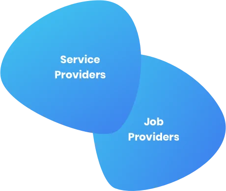
The biggest challenge of the project was to identify user personas and map out the user journey as they were highly crucial for the successful implementation of the idea.
We realised there wasn’t any specific target audience and the app would be used by a different set of users belonging to different demographics, so it was crucial to design it in a way that it would be relevant and easy to use for everyone.
The design process

Design conceptualisation
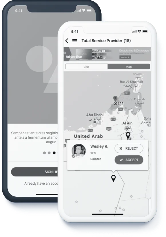
After a detailed listing out of all the features and requirement gathering for the project, our team of UX consultants and UI architects helped design a highly responsive and intuitive mobile and web app.
To achieve simplicity and place information at the center of our design we started off by sketching out wireframes. This helped us capture the exact requirements and make a skeleton of the actual product.
Visual & aesthetic design
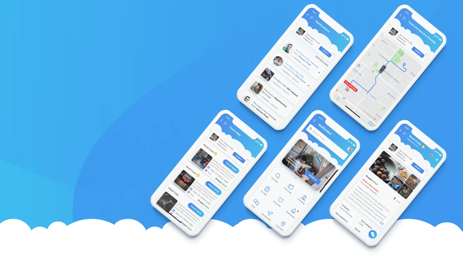
Next we worked on the interface and visual design of the app. We created a design that would not be too overwhelming yet grab the users attention. A combination of blue and white color schemes were picked to make it eye catchy and elegant.
The blue gradients worked perfectly across the white background. With just a dash of few colors and a cloud theme that complimented the overall aesthetics, we finally completed the design.

The core UX fundamentals
For us good design means that relevant information is provided at the right time and with minimum efforts. We wanted our users to reach their desired goal with utmost ease so we designed some core UX features.
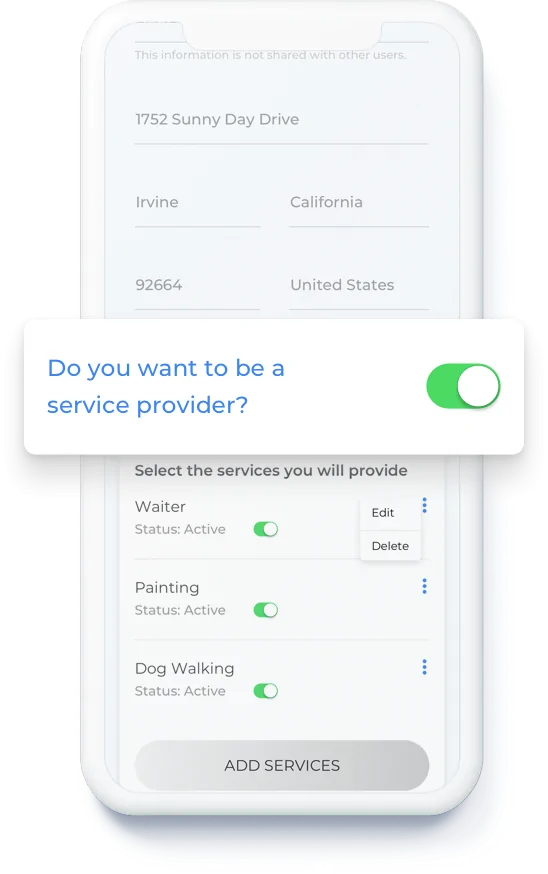
Switch account
We wanted to create a community through SwiftJobs, so we allowed the users to easily switch from a job provider to a service seeker and vice versa. This made the platform more viable and efficient for everyone involved and was a winning feature of the platform.

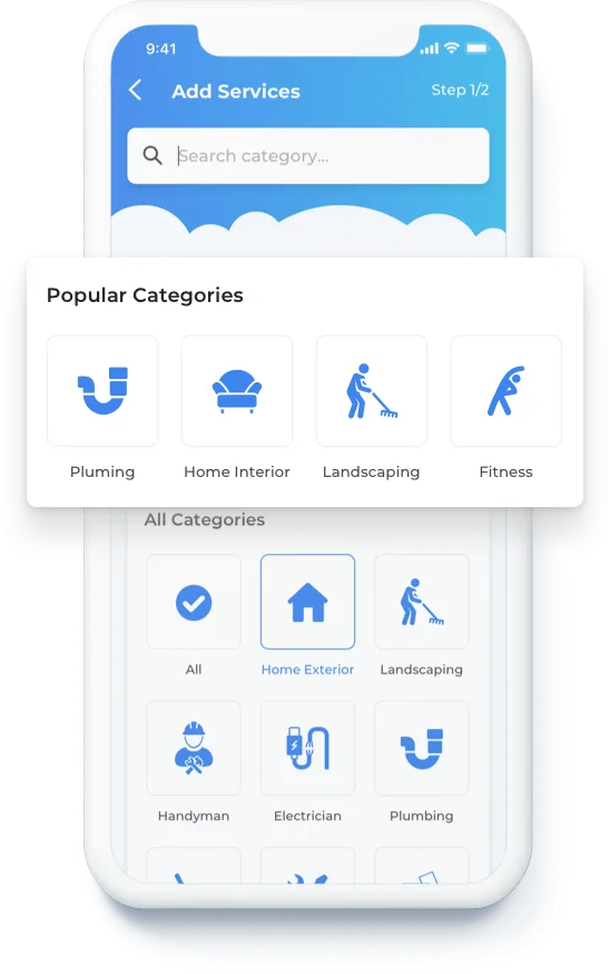
Service listing
Since there was a long list of services to choose from , we used different techniques to make the app easy to navigate with the help of various icons and call to action buttons. Our focus was to keep the user behaviour in mind at all times and enhance their user experience likewise.
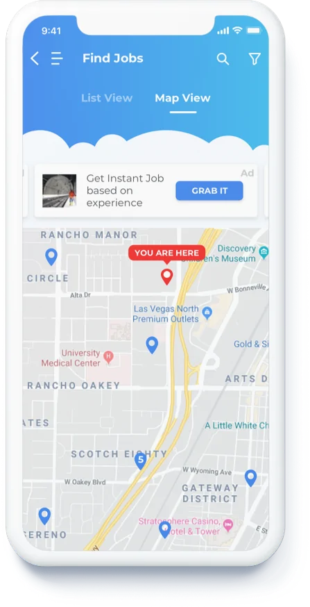
Filter by address
We let users find services near them through their postal code and street addresses. We added multiple service category icons alongside for easy filtered search. The overall look was kept clean with visible icons for quick search results.

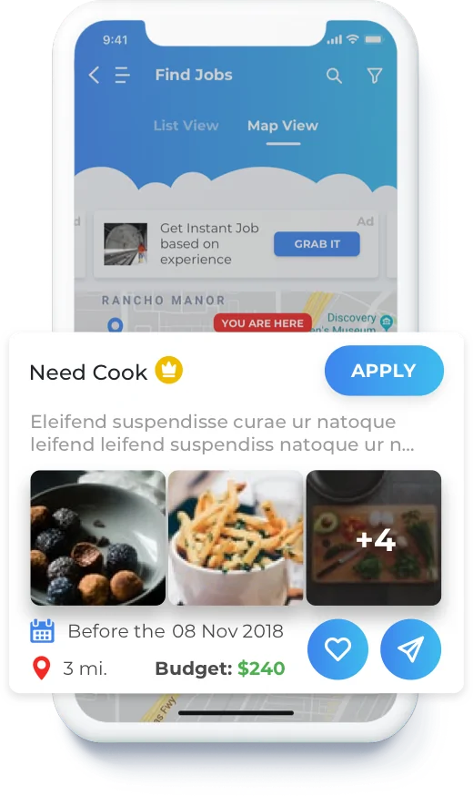
Detailed map listing
We provided a map view of service providers with detailed description for each provider. The map view would show the distance between the service provider and finder. This feature was carefully curated to enhance the UX and deliver the best results.
Real time tracking
We also incorporated real time tracking where services providers can be tracked from the time they were booked and even after the appointment was over. This feature was designed for better time management of all the users involved in a transaction.
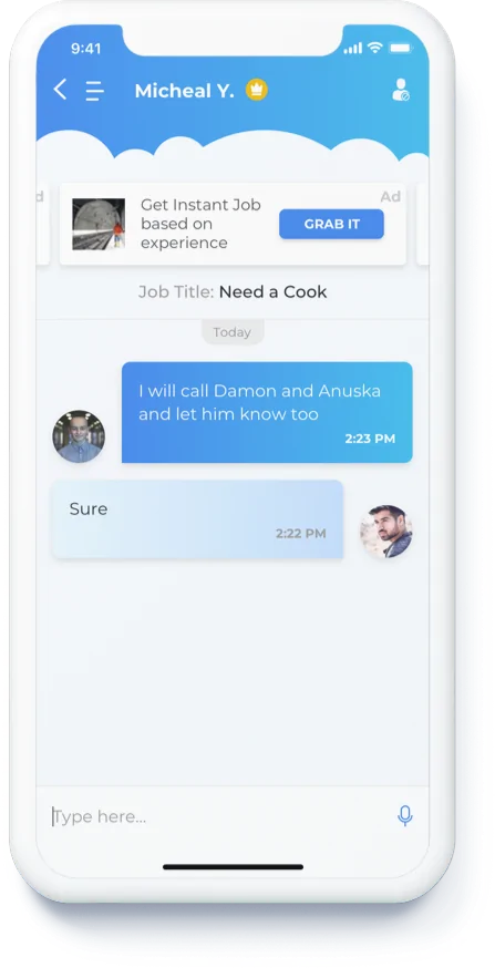
Built-in chat & message requests
To make communication easier, we added a chat option for the users. To make it further secure, we added an option of chat and message requests to allow only filtered messages. This not only helped users communicate when they wanted to, but also created a community.
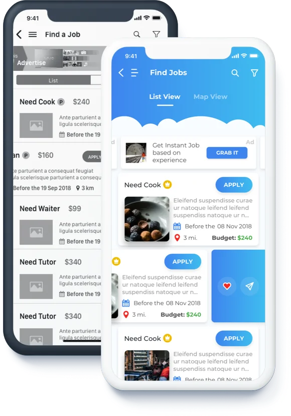
Design to Development
To build SwiftJobs we used React Native development which is a framework that supports both iOS and Android. This would help the client reach as many potential users as possible and the reusable components of React also made it a very cost-effective platform.
We developed an intuitive storefront in ReactJS to give life to our designs. We used NodeJS for end to end easy Backend API management. An additional benefit of automated unit cases for easy bug testing made the platform extremely impressive in terms of functionality.

The final take away
The final take away
After working on creating various types of job portals including white collar and blue collar jobs, this project was a stand out for us as it catered to an industry area that desperately needed a platform like this. The takeaway for our entire team was how beneficial it really was to instantly hire service providers and how to help these service providers meet potential clients on a daily basis, all so with just a few clicks.
"Great execution and design thinking applied by the team. I have high hopes to take this project forward and looking to develop phase-2 with team FewMoreTaps" -
Mike Lenard
Ready to start a Project?
Trusted by

Ron Shai & Slava
FEPO Corporation
“What a team! Unbelievable. Starting from task to completion, we couldn’t have asked for a better team.”

Kevin Giffhorn
WeLearn Educational
“They listened to my ideas, made recommendation and helped me make the app that I wanted to make.”

Daniel Lewis
Forex Signal
“FewMoreTaps comes up with great ideas that we implemented, which helped my business.”
All projects secured by NDA &100% Secure. Zero Spam.
This site is protected by reCAPTCHA and the Google Privacy Policy and Terms of Service apply.
To start, use form below to tell us about you and the project

