- Home
- About
- What We Do
- Solutions
- Work
BookMyTaxi
Helping BookMyTaxi capture a larger audience with an online platform.
Gofer
How we changed the experience around running errands through gofer.
Sparker
Designing a platform that goes beyond just a dating app
SwiftJobs
Simplifying your everyday job search and service hunt
- Technology
- Methodology
Gofer
Mobile App
How we changed the experience around running errands through gofer.
About Gofer
Gofer is an app that fosters the way people purchase grocery or get things picked up and delivered at their homes. With just a click of a few buttons, you can order, approve, cancel, track and receive your order in no time. We designed two flows for the app, One where the driver can either pick up the requested items or can purchase products requested by the users through the app.
Our Challenges
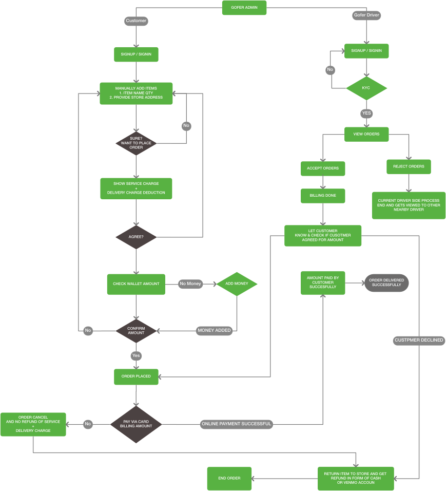
After a lot of brainstorming and detailed requirement gathering, we decided to design two apps for Gofer. One was the user app and the other one was a driver app. The biggest challenge while designing this was to keep the experience around the user journey similar and relevant to each user.
For example one of the key aspects of the app, as you can see in the user flow diagram, was when the user placed an order after paying a token amount to the driver, some things can be out of stock or low in quantity. The driver would then notify the user with a ballpark estimation of the items as well as inform them of the unavailable items. The user can either confirm the order or decline it.
Keeping this flow simple as well as designing the interface in a minimal and user-friendly manner so that the users can quickly get the correct information in time and take relevant actions was what made this challenging for our team.

Purchase & Deliver Flow

Pick & Deliver Flow Screens

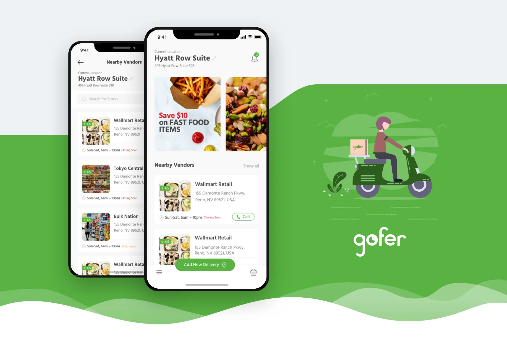
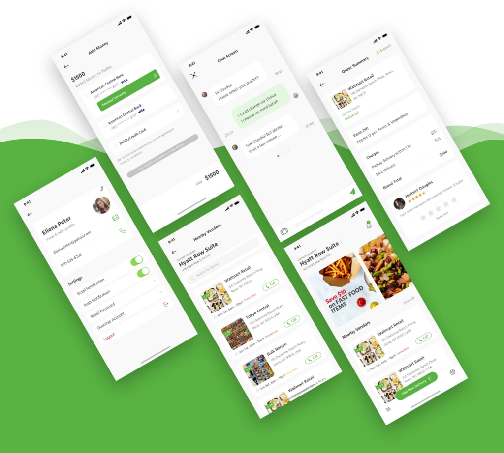
Nearby Vendor Listing
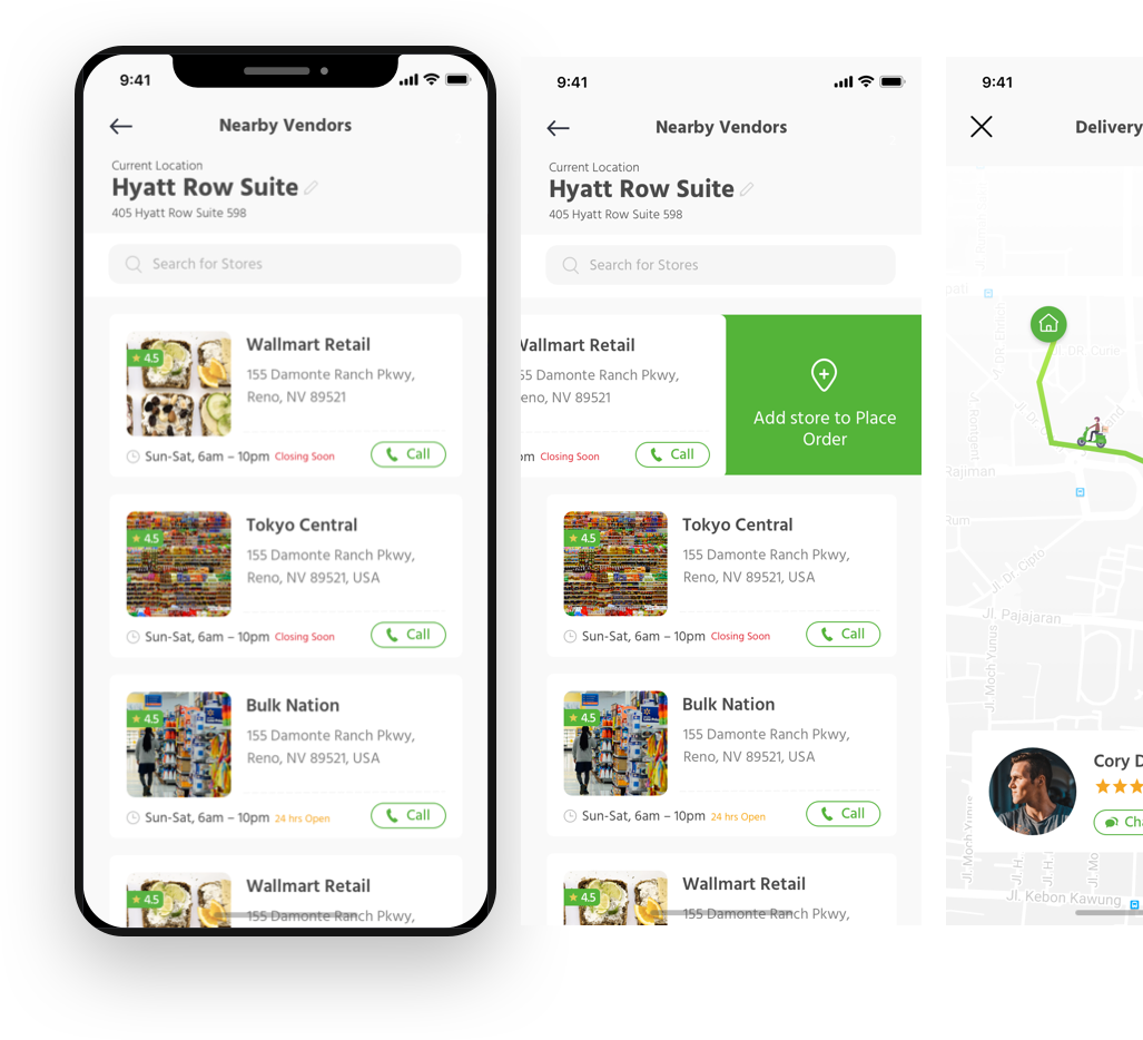
While placing the order on Gofer app, we provided users the option to order from nearby stores or search a store based on their preference. To enhance the overall experience as well as generate revenue for our client, we suggested that he introduce offers and discounts for nearby stores in the home screen.

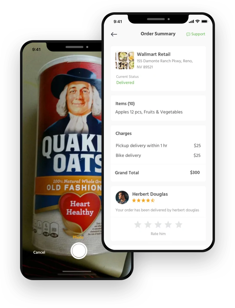
Place Order | Order Details
While creating a seamless flow for the users while placing an order, we had to first understand the users and their mindset. We analysed the information and the knowledge our users i.e customers and drivers would have and then went onto design a relevant feature for both. To simplify things while placing orders, we added an option to add images of items. This was one of the key UX features on the app.
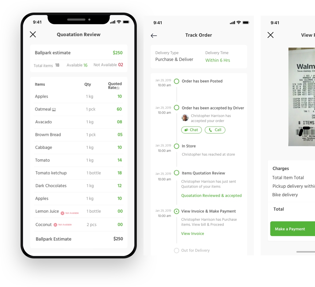
Token Amount | Review Order
There was a major challenge we faced while devising the payment module for the users and the drivers. After a few fallbacks we suggested the client to introduce an initial ‘token amount’ that the driver would receive regardless of the order being rejected or a few items missing. The final payment would happen only after the user has reviewed the order and approved the prices of the items.
This was a rather challenging flow to design as we had to keep both the users in mind and define their end goals to get to the solution of the platform.

Color Palette
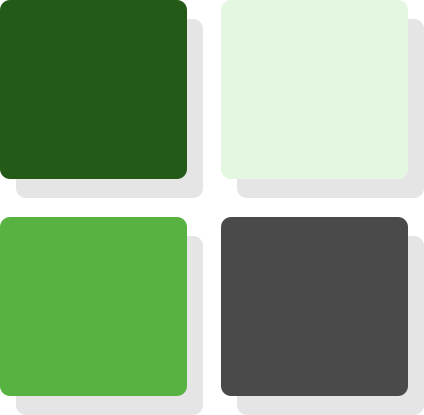
While choosing color palettes for any user interface, we understand the design color psychology and match it with the business idea. Since this was grocery delivery app, we went with shades of green and grey to create relevance.
Typography
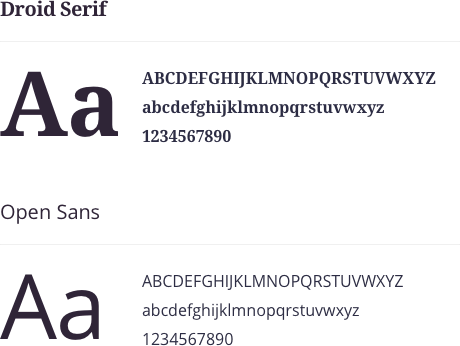
The typography for any user interface, where there is a lot of information being absorbed, we kept it minimal, bold & eye catchy.
The Final Take Away
The entire project was completed within a month as the client wanted to send it in development as soon as possible. Our designers worked around the clock with the client to bring Gofer to life. With very smooth and easy communication on a regular basis and a seamless feedback loop, Gofer was completed successfully.
"This is pretty amazing. It looks great. Thank you everyone from the team for creating such excellent interface" -
Alex Kasperowicz
Ready to start a Project?
Trusted by

Ron Shai & Slava
FEPO Corporation
“What a team! Unbelievable. Starting from task to completion, we couldn’t have asked for a better team.”

Kevin Giffhorn
WeLearn Educational
“They listened to my ideas, made recommendation and helped me make the app that I wanted to make.”

Daniel Lewis
Forex Signal
“FewMoreTaps comes up with great ideas that we implemented, which helped my business.”
All projects secured by NDA &100% Secure. Zero Spam.
This site is protected by reCAPTCHA and the Google Privacy Policy and Terms of Service apply.
To start, use form below to tell us about you and the project

